Dreadnok
Rampage; Escapade in the Everglades
G.I.
Joe International Collector's Convention, 2004
WARNING! This review is VERY graphics-intensive! It may take a long time to load through a slow connection...
Toy
name: Dreadnok Rampage: Escapade in the Everglades
Assortment: Convention Exclusive,
2004
Price: Assorted
Availability: July, 2004
Key Features & Price Points
- 15 Figure
Set w/ Filecards, accessories, and Dreadnok Trike- $240.00
- Dreadnok Drivers 2-Pack (Thrasher and Zanzibar)- $40.00
- Morphing Zartan 3-Pack (Zartan, Zartan/Hawk, and General Hawk)- $50.00
- Dreadnok Stun- $40.00
- Tiger Force Tiger Ray Hydrofoil- $65.00
Every year around this same time, controversy rears it's ugly head in the online G.I. Joe community (well, let's face it...when does controversy NOT rear it's ugly head in the online Joe community?). It's Convention time, and whether your one of the lucky ones with the funds and availability to go, or if you're one of the unlucky ones without cash, time, or desire, no one can deny that the G.I. Joe Collector's Club and Brian Savage go out of their way to put on a great show and to get us some unique exclusive items available only at that time and place. Sometimes they are very successful, sometimes they are moderately successful, and sometimes the choices are kind of bizarre. It's always entertaining, though, and it always gets the Joefans talking, and who can argue with that?
At the beginning, I was already a little disgruntled about this year's Convention set. I am not, and have never been a Dreadnok fan. To me, enemies with too much comic relief stop being a threat and start being a joke...at first the Dreads walked that fine line pretty well, but in the cartoon, and near the end of the comic's life, they couldn't be taken even remotely seriously. Add that to the fact that the original three Dreadnoks molds (my favorite Dreadnok characters) were old and extremely dated, and my interest in the subgroup waned considerably. I could not see how 15 figures worth of Dreadnoks (and Tiger Force, for that matter) could possibly interest me. Well, with some choice storyline alterations, and some very cool late-year mold selections, the GIJCC seems determined to turn me into a Dreadnok fan again, something that Hasbro had already started with some cool new-sculpt re-releases. But the real question should be are these items all cool enough to trek down to Florida and pay ridiculous sums of money for? In some cases, yes. In some cases, no. But in any cases, Convention weekend is one of the best weekends of the year, and even if there were no exclusives offered, I would be there every year to hang out with my fellow G.I. Joe fans and shoot the breeze.
But you're not here to listen to that ...you're here to see how cool or uncool these 2004 exclusives are. Let's start at the top:
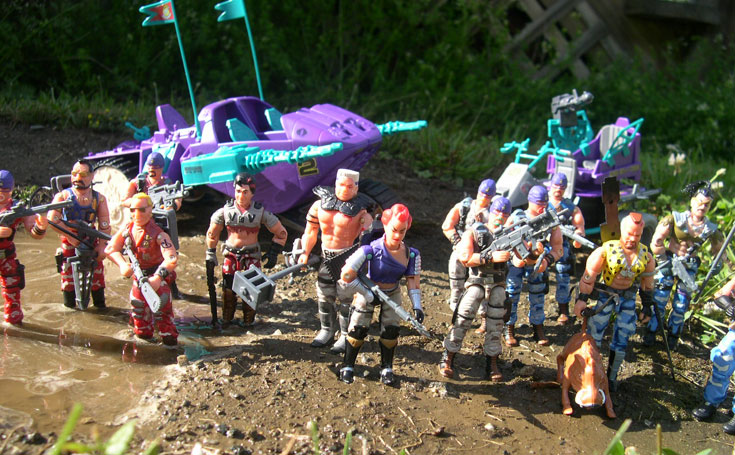
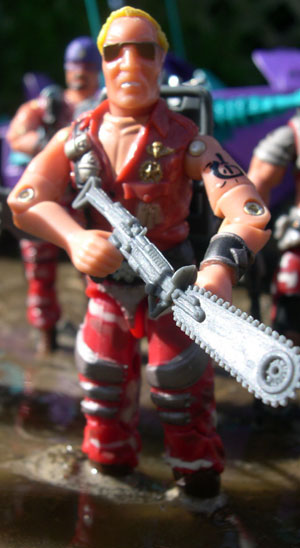
Undoubtedly the major draw of this year's set is the Dreadnoks. The punk rockers from all over the world with bad attitudes and a penchant for wanton destruction have been a staple in the Joe line since 1984, and have been growing in number ever since. But never have they seen such an upswing in membership in one fell swoop as they did with this set.
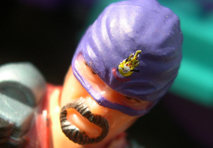
Not only did we get new Dreadnoks, Crusher and Demolisher, but we also got the six Dreadheads, masked identical cousins with a mad on for Beachhead and a desire for violence. Their histories are a little goofy and the filecards are humorous camp, but the Dreadheads themselves have a pretty cool aggressive biker-look to them. Since they're one of the main focuses of this set, let's cover them first:
Above are Otis and Cletus two of the Dreadheads, this pair dressed in red camouflage to go along with Ripper, Buzzer, and Thrasher's team. Otis is the Dreadhead leader.
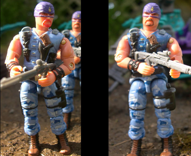
Above here are Joe-Bob and Billy-Bob, colored gray to match Zarana and Roadpig.
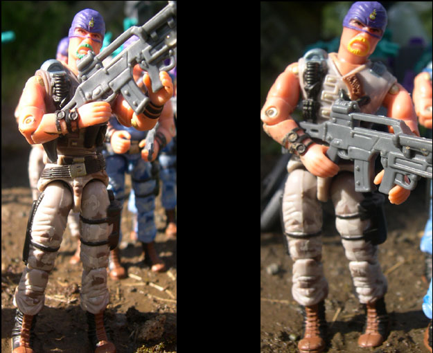
The above two Dreadheads are Roscoe and Vance, colored blue to go with my favorite team, Crusher, Demolisher, and Zanzibar. It would appear that the Collector's Club may have been going with a red, white, and blue type of theme to match the July 4th Convention Date.
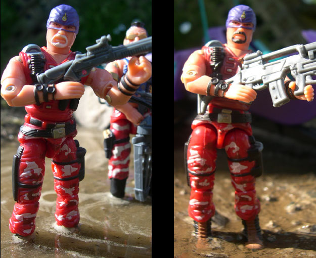
Now since the Dreadheads all maintain the same body/head molds, I figured I could cover them all in one segment of this review, since the only thing that really differentiates them is the colors of their uniforms and facial hair. They all come with a machine gun and shotgun (the same weapons and colors for all) and all of them are decked out in some very nice camouflage patterns in different color schemes. Something else that I'm not sure has been noticed yet is that the vests on each is a slightly different shade of color. The two Red Dreadheads have different hued vests, as do the grays and blues. It's a nice little touch to separate the two a little bit more than merely a different color of goatee.
The overall molds of the Dreadheads are actually pretty appealing, even though the story of six identical cousins seems pretty far-fetched. The bodies use the '88 Muskrat mold for the torso, waist, legs, and arms, with the addition of the '90 Aero-Viper head to make them stand out. when I first saw the combination used on the Otis figure, I immediately loved the outcome, although then (and now for that matter) I was hoping that the rest of the Dreads might at least get different heads. I really do like the Aero-Viper head, but with five of the cousins masked, things don't get stretched quite so far, and the figures stand out a little bit better. Still, I know the GIJCC has limitations in supply and financing, and I think they did pretty well with the choices that they had.
The Muskrat molds, being from the late 80's, seem to strike a perfect chord between proportion and bulk. The muscles are well-defined, the bodies are nicely proportional, and the figures end up looking pretty imposing, yet maintain a lot of poseability without articulation hindrances like some of the later figures had from the 90's. If you had told me that they would use Muskrat's mold to make a Dreadnok I would have called you nuts and said that it would never work, but in this capacity it looks pretty good and works well. The heads are extremely successful, too, although I still wish that they had masked some of the cousins, just to avoid the ridiculous similarities between them all. Having Otis' face exposed, and the rest under cover would look pretty cool, I think. As it is, though, I think the heads still maintain some good function. Goatees are common enough these days to consider that several guys in the same gang all have them, and the Aero-Viper head is wonderfully sculpted. It works to near-perfection as the head of a good ole' southern boy, and the different color goatees, while a little odd, is a decent way to tell the guys apart. Hell, you could even say part of their gimmick is the fact that they all look the same.
As nicely sculpted as the mold is, the colors and paint apps are where these figures really stand out. Over the past two years we've gotten some great molds and decent colors, but not the complex level of paint apps as we're getting this year. Every Dreadnok (and Dreadhead) are decked out in full camouflage uniform pants, and the patterns look realistic and effective, even if the base colors are a little silly. Speaking of base colors, the Dreadnok team looks to be divided up into three groups: Gray, red, and blue. Considering what time of year the convention occurred, though, I think it's a safe bet that the gray is really supposed to be "white". Each color is led by some of the named Dreadnoks, and the colors are all very appealing. The gray combo camouflage is light, but well-applied with darker and lighter splotches of camo bringing the colors out nicely. The other two colors look great as well...the red is a nice deep, dark shade of crimson, looking muted and not too light to be effective. It is not a realistic shade by any stretch of the imagination but the application of the camouflage and the overall look of the paint scheme makes it look great anyway. My favorite color scheme, though, is easily the blue team. I love the rich blue color base, and the camouflage works terrifically. It only helps that the characters in the blue team are great as well, with the two new Dreadnoks looking great in their striped blue camouflage pants.
The final touch on the figures is the tampoed Dreadnok logo on the bandanas, which looks pretty near flawless. The size and application of the logo is fantastic, and it brings out some nice detailing in the head and the mask, combining with the goateed face to make a nice and menacing Dreadnok "trooper" who isn't really a trooper, but looks great and is effective in what it is trying to do.
 Next
in line is Zarana, the apparent overall leader of the team, and head person
on the Gray side as well.
Next
in line is Zarana, the apparent overall leader of the team, and head person
on the Gray side as well.
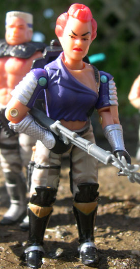
Zarana has always been a fixture in both Joe media, even at one time appearing to be COBRA Commander's right hand "man" and trying to worm her way into Destro's good graces. She seemed to almost be a late 80's, more modern punk version of the Baroness, but did not work nearly as well without the Euro-trash look and attitude.
Even when this figure came out in 1986, she went quickly into my junk drawer and was rarely, if ever used. In my mind the Zarana character was way overused in the comics and cartoons and carried little to no appeal to me. I'm not sure why, but she always struck me as boring and useless in comparison to her two brothers, which I loved and used extensively while growing up.
Perhaps there was some truth to the Hasbro market tests that said boys don't play with girl toys, although I loved using Scarlett and Lady Jaye during that same time period.
A lot of times, I can find myself overlooking the failings of a character as long as their figure representation is cool enough to make up for it. Unfortunately, in Zarana's case there was nothing about her mold that made her the least bit desirable to me either. I'm not sure why, but it seems squat, short, and unimposing. The bright pink and blue colors did nothing to help the flaky 80's punk-wannabe sculpt and even as a kid, I think I realized this bizarre fad of 80's clothing was a flash in the pan and would stop once people realized exactly how ludicrous they looked.
Lucky for Zarana, the Collector's Club did find it in their hearts to beef up her color scheme nicely with some gray urban-camouflage pants, black boots w/ brown straps and a very cool dark blue shirt. Every single one of these colors is a huge improvement over the color schemes of the original, and almost makes the figure a nice one. The bright silver shoulder pads and forearm gloves add a great splash of different color to the mold, and the combination of the different hues looks fantastic.
Unfortunately, in my opinion, at least, you cannot polish the Zarana figure enough to make me like it. The mold is still short and squat, unimposing, and about 20 years out of date with no relevance or use in modern days. She looks ridiculous and about as far removed from an evil terrorist organization as you can get. And her old mold makes some of the new paint apps suffer as well, as the GIJCC attempted to paint over her ripped pants, and it ends up looking a little silly.
Thankfully, in Wave 8 of Spy Troops we actually got a halfway decent Zarana, and is right now the only reason this character will ever see any use in future Dio's. That version of the character is worlds better than this one, and I think it's safe to say that this is probably the weakest figure of the Dreadnok Rampage set.
 However,
all is not lost for the gray team. Even though they are the least represented
of the Dreadnok Rampage figure teams, they do get some muscle and brawn to go
along with the brains of Zarana.
However,
all is not lost for the gray team. Even though they are the least represented
of the Dreadnok Rampage figure teams, they do get some muscle and brawn to go
along with the brains of Zarana.
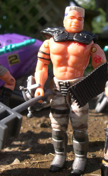
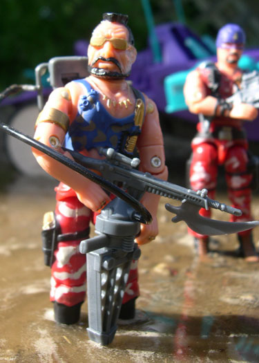
Pretty much everything I said about Zarana's mold is the opposite of the Road Pig mold and character. While her use in the comics soured me on the character, the way Road Pig was portrayed by Larry Hama gave the character a personality that would have been impossible based on the plastic figure on it's own. Donald and Road Pig are now an indelible mark on the Dreadnoks, and their love for Zarana plays well in the Dreadnok Rampage set, and the figure looks pretty damn cool here, too.
I will admit, that I didn't use Road Pig much as a younger man. Sure he was strong and powerful, but there was little about the mold that was really interesting. He was basically a bare-chested brawler with some flaky armor and close combat weapons that served little purpose. As time has moved on, though, I have gained a new appreciation for the mold based on character lone. His conflicted personalities make Road Pig a classic character to try and get your mind around, and his devotion to Zarana is a great plot device.
This mold nicely maintains everything that was good about the classic one as well, but only improves it with different plastic quality and a much better paint scheme.
First of all, like the original, Road Pig is HUGE. This guy is a beast, plan and simple. His shoulders are broad, his arms massive, and his legs like tree trunks. His neck is short and squat, and immediately you get the idea that this guy is a Dreadnok strong man. He could duke it out with Roadbock and trade punches easily. Proudly striding into pitched battle bare-chested and angry, all it takes is a switch from Donald to Road Pig and he becomes a deadly weapon all on his own.
The torso and arms are sculpted well, with accurately represented muscle tone making him not ripped like a body builder, but just huge and imposing, which is just how he should look. While this look does make his top half pretty plain, it works for him, and with the addition of his body armor, he has a lot more to look at. His legs are nicely sculpted as well, looking very, very big and adorned with some very strange, yet great looking metal boots ...I can only imagine what a kick with one of those things would do to a human being.
But, as I've said countless times, the mold can only be as good as the paint apps over it, and luckily Road Pig shines there as well. While his first version was pretty much black, brown, and silver, this one brings out some great detail with the urban camouflage pants. It's amazing what a small addition like this can accomplish. Suddenly the entire figure has a whole new life and looks a lot better than before.
Another much appreciated detail is the paint apps to the two tattoos that Road Pig now has. The anarchy tattoo is still present and looking accurate on his arm, which is awesome...but the coolest part is his new chest tattoo. Hasbro/GIJCC have both taken this interesting take on the COBRA logo to a new level, and it looks fantastic as an oath of loyalty burned into Road Pig's chest. It's nicely painted and breaks up his bare chest fantastically...it almost makes it worth keeping his body armor off.
Overall, I am quite pleased with the Road Pig figure ...something I was not sure I would be. I liked the mold all right back in the day, although it wasn't one of my favorites. This new release has breathed new life into it, though, and makes the figure really stand out as a great Dreadnok. He's the saving grace of the gray team, too, as Zarana doesn't do much for me, and I need someone to lead these Dreadheads into battle.
 As
I said earlier in my review, the Dreadnoks never really hit a home run with
me, after the original three came out around the same time that other molds
were getting beefed up and added with the ball-joint neck.
As
I said earlier in my review, the Dreadnoks never really hit a home run with
me, after the original three came out around the same time that other molds
were getting beefed up and added with the ball-joint neck.
Comic relief doesn't do much for me when a terrorist organization is concerned, and the Dreadnoks just seemed to screw up far too much to be useful. However, I still liked the characters somewhat, with Buzzer by far being my favorite of the group. His filecard history was terrific, introducing the concept of a highly educated and motivated individual ending up on the wrong side of the law.
Buzzer always seemed to me, to be the default leader of the Dreadnoks when Zartan wasn't around, and his attitude really appealed to me...the storyline in the comics where he kidnapped Ripcord's girlfriend was played out relatively well and gave him some unseen personality However, he has only received one action figure to this day (until this one) and the figure seemed clunky and unappealing, limiting his use in my world.
I think the main problem with the original three Dreadnoks is that they were releases around the same time that the Joe line was getting resculpted and beefed up. At the same time we were getting larger and more muscular molds of Snake Eyes, Flint, Alpine and the like, we ended up with figures scrawny and useless by comparison. The very appearance of the Dreadnoks was not threatening simply because all other figures coming out at that time looked larger and more detailed.
Buzzer's arms and overall mold are very skinny, and his facial sculpt just looks strange. His shirt is nicely detailed with grenades and other items of note, but his legs just plain baffle me. I have absolutely no idea what those little pieces of metal armor are on his pants and they do not seem to serve any purpose at all. The hair/ponytail combination looks interesting, but it is pretty much the only thing I find intriguing about this mold at all.
And unfortunately, in this case, the paint scheme does not help at all. Buzzer just looks plain weird in all red and those camouflage pants just do not work with that armored plating on them. His color is dull and off-target and it just does absolutely nothing for me. If his mold looked dated back in 1985, it looks downright ancient today compared to the plethora of nicely molded and bulked out figures from the 90's and now.
I realize that the original three Dreadnoks do have a following...but until they all get suitable updates I do not consider myself one of the Dreadnok faithful. Ripper has gotten a great update, and it looks like Torch has a fantastic one in the works ...perhaps by the end of 2005 we'll get a new Buzzer that gives some life to the character again and will allow me to finally create the Dreadnok team I haven't been able to up until this point.
 I
actually considered just cutting and pasting Buzzer's review into this spot
here, but figured that wasn't exactly fair treatment of old Ripper here. ;)
I
actually considered just cutting and pasting Buzzer's review into this spot
here, but figured that wasn't exactly fair treatment of old Ripper here. ;)
Truth be told, even though Ripper falls under a good deal of the same pitfalls that the original Buzzer did, I don't detest his mold nearly as much as I dislike his partner in crime's. Perhaps it's because he's not saddled with silly looking armored pants, or maybe even just because of his cool as heck rifle, but whatever the case may be, I actually do not mind this figure.
But do I really like it? No, not at all. Ripper falls into that weird void of rare figures that I don't really have a feeling for. He just kind of exists.
His head sculpt looks nice and mean, as well it should, and back in the 80's, in the days of the A-Team, anyone with a mohawk was cool. His scowling face and cool sunglasses give him some great character and succeed in several ways that the Buzzer mold did not. Buzzer looks lean and scowling, while Ripper looks just plain mean.
The torso mold works nicely, too with a torn tank top adorned by a downright scary spike-knuckled knife and a necklace of bullets. His twin grenades are definitely too small, but are a nice addition anyway. Like Buzzer, his arms as pretty scrawny, but are broken up nicely by brass armbands and knucks.
His pants work well as your run-of-the-mill blue jeans, with just the right additions to them with a holstered pistol and some other little touches here and there that look okay. Overall, the mold has some nice components, just because of it's slimness it doesn't quite take Ripper to the next level.
The paint scheme on this version of Ripper also isn't much of an improvement. It is more complex with the different camo paint apps, but more complex doesn't necessarily mean better, and I actually prefer the simple green camo and blue jean look of the original. Like Buzzer, Ripper doesn't work especially well in these odd non-realistic colors, even though a lot of the other Dreads look nicely in them.
Not helping the fact is that the new sculpt version of Ripper is a great rendition of the figure, and that will only ensure that this particular figure stays in it's storage drawer and doesn't see much use. I am happy, though, that in this case, as well as with Buzzer, the GIJCC was able to locate all of their original weapons and give them to them. Where the Dreadnoks are concerned, that is very important.
 Now
we move onto the gems of the Dreadnok Rampage set, which are without a doubt,
the two new Dreadnok additions.
Now
we move onto the gems of the Dreadnok Rampage set, which are without a doubt,
the two new Dreadnok additions.
For years, fans have been clamoring for Hasbro to take more of a customizer's approach with figures. Take some different existing molds and put them together to form a new character. Granted, not all parts fit together perfectly, but it's a great way to explore some different characters and combinations without the expense of new tooling. Well, it seems with the Comic 3-Packs, Hasbro is learning, and it also seems that the lesson wasn't lost on the Collector's Club either.
It's pretty amazing what some part swapping and color alterations can do, and this is a perfect example. Take the Street Fighter II Sagat head and the 1987 Steamroller body, and you get an instant Dreadnok. A figure mean and muscular, with a ragtag, yet realistic uniform full of deadly instruments. This figure works fantastically as a Dreadnok.
I think using Street Fighter II molds is a great idea...these are parts that we know will work with Joes, yet are not established characters, and can easily represent new people in the Joe mythos. Sagat never existing in Joeland, so seeing this head on a new body requires no suspension of disbelief and he immediately becomes Demolisher, as he should.
No longer satisfied with mere destruction and chaos, the Dreadnoks are now branching out into operatives armed with machine guns, shotguns, grenades and muscles, eager to lay some punishment down on their enemies as well as the enemy equipment.
Sagat's head works perfectly for this particular Dreadnok with a menacing grimace, a telltale eye patch and scarred, warped bald head. He looks mean, dangerous, and ready to strike, just as a Dread should.
His arms are large and muscular, fitting in with the broad, stocky head perfectly, and Steamroller's torso almost seems made for a Dreadnok. The open vest loaded with grenades is right up Demolisher's alley, and I really love the paint choices for those grenades.
Matching the explosive paint scheme is the handle of the pistol, holstered just under the belt, which is another little detail that works really well for this figure...once out of grenades, I can see Demolisher using this revolver as a last resort. fighting until the bitter end. The rest of the mold is deceptively simple, with only a pair of baggy pants pulled over some combat boots, with no extravagant detailing work or anything else. But even these simple pants are brought to life by the great blue/white camouflage that the GIJCC has employed on the blue team. As I've said, these shades are by far my favorite, even if they're not the most realistic and bring a nice flash of color to these Dreadnoks without making them overly bright and cheery.
So, overall, Demolisher is definitely a cool addition to the Dreadnok family, and I even like his filecard. His numbed nerves making him pretty close to impervious to pain is a neat item of note that I could focus on for future elaboration of the character.
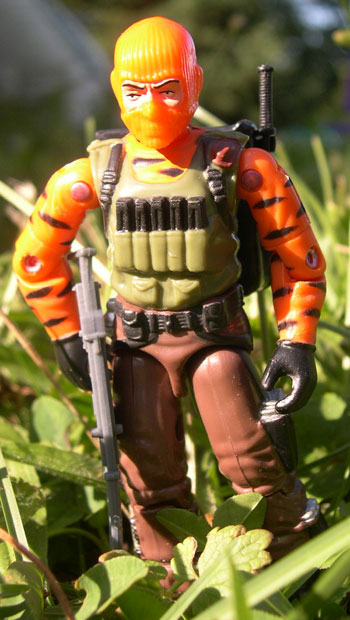
 Following
much of the same formula as they did with Demolisher, the Collector's Club takes
an established mold, throws a Street Fighter head on it, and calls it a new
character. Like Demolisher, this new member of the gang works very nicely, even
though he shares a look extremely similar to a past member, Gnawgyhde.
Following
much of the same formula as they did with Demolisher, the Collector's Club takes
an established mold, throws a Street Fighter head on it, and calls it a new
character. Like Demolisher, this new member of the gang works very nicely, even
though he shares a look extremely similar to a past member, Gnawgyhde.
While a lot of people didn't like how similar he looks to the old Dreadnok, I personally don't have a problem with it. Their torso is colored the same way, sure, but they're just colored like a leopard skin, and I could easily see multiple people having leopard skin vests that look similar, even if you don't use the filecard's excuse that Crusher dispatched Gnawghyde and stole his gear.
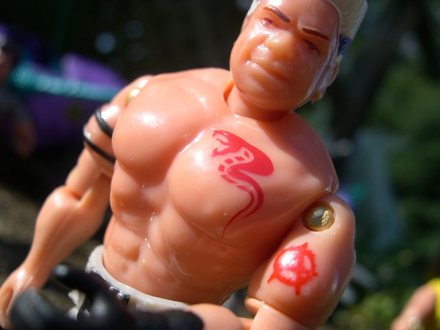
Crusher's bio is also pretty cool...whether it's because I'm an ex-WWE junkie or not, the concept of a professional wrestler being in the Dreadnoks just works for me, and this figure definitely has the build to do it. I can see Crusher powerbombing and suplexing all those in his way, and yes, I do realize those moves simply would not work in a practical setting. :P
Gnawgyhde's mold works wonders for this figure, with a huge barrel-chest and insanely well-defined muscles. Just a mere look at Crusher and you know he could break you in half, which is a great trait for a Dreadnok to have. His head sculpt, being Zangief from Street Fighter II (also a wrestler, interestingly enough) is another fantastic choice, employing a cool, mean looking facial sculpt with the ever-present angry scowl. The hairdo works as well, maintaining an almost punk look to it just to keep that Dreadnok edge.
I've already mentioned the muscular chest, but his large shoulders and downright massive arms only build on that, and little added details like the fingerless glove on the left hand and slim armband add even a little bit more. His upper body is just large and powerful, and a terrific choice for an ex-wrestler Dreadnok. With some nice splashes of color, his lower half works well, too, really differentiating this figure from his earlier incarnation. Where the original Gnawgyhde had dark blue pants, Crusher is clad in blue/white camouflage which works very nicely and makes him suitably different. I love the color scheme he's got going on, it all blends together with near perfection and we get a cool addition to the Dreads, who, in my mind, is better than the one he replaced.
If there is one somewhat off point to this figure, it lies in the accessories. He carries all of Gnawghyde's original accessories with the exception of the rifle, but the hat does not fit, nor does the knife fit in his boot sheath. These are very minor points, but something to mention as small negatives. Speaking of the boot sheath, I loved this when Gnawgyhde came with it and I still love it now...perfect for a "poacher" figure who always needs a sharp blade at the ready. I would be remiss as well if I did not mention the rockin' tattoo he's got on his head as well. Like Road Pig, Crusher has proven his loyalty to the Dreadnoks and the COBRA cause by emblazoning their logo on his HEAD. I can't even imagine how much that hurt, but the intimidation factor is huge, and it works really well for this figure.
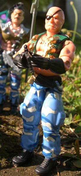
This covers the Dreadnok side of things for the normal Dreadnok Rampage set...but how cool are the villains without some heroes to fight them? We learned early on that these Dreadnoks would be faced down by a specially picked Tiger Force team, and with our first view of Beachhead we saw that this Tiger Force team wasn't your father's Tiger Force. Bigger, brighter, and errr... "oranger" than any Tiger Force before them, these Joes were handpicked to fail, all decked out in similar colors and paint decos. So, how do they compare to the punk villains they face? Depends on what angle you want to take...
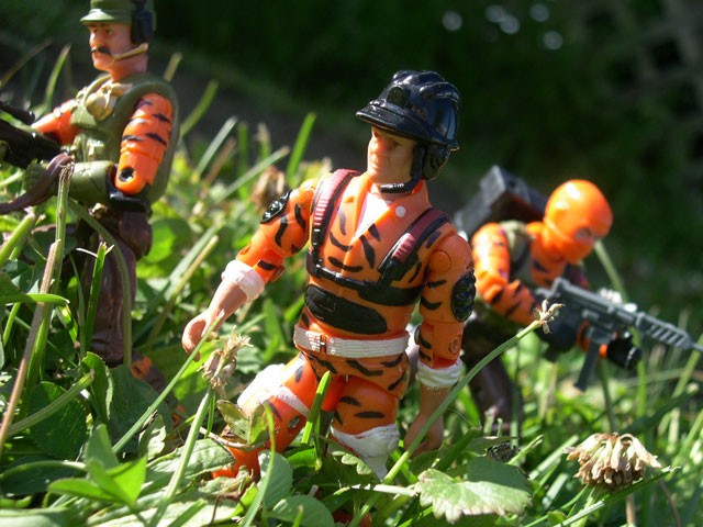
Ever since 1988, Tiger Force has been known as G.I. Joe's first and arguably their most prolific subteam...but a lot changes in sixteen years.
Back then, the "tiger" in Tiger Force was mostly a metaphor, just meaning the troops carried tiger striped uniforms. Mostly in browns, greens, and tans, the Tiger Force of old wasn't necessarily designed to resemble a tiger, they were meant as jungle troops, still decked out in subtle hues.
Sure, there were some exceptions like Bazooka's white jersey and Lifeline's yellow jacket, but they still tried to maintain some sort of jungle camouflage and dark hues. Well, this all ended with the European exclusives, and I'm sorry to say those exclusives might have ruined Tiger Force for the realistic military collector for some time to come.
I need to be clear, though...it's not because those figures are bad figures. I find myself quite interested in the European exclusives with their cool bright blues and oranges...but they are not in the least bit realistic. They are meant to be and collected as collectors items and display pieces, not as realistic military figures to be used in a jungle setting. However here, the G.I. Joe Collector's Club tries to take a bright approach to the Tiger Force, but tries to use it realistically, and it doesn't really work as such.
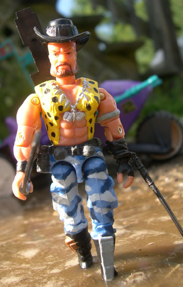
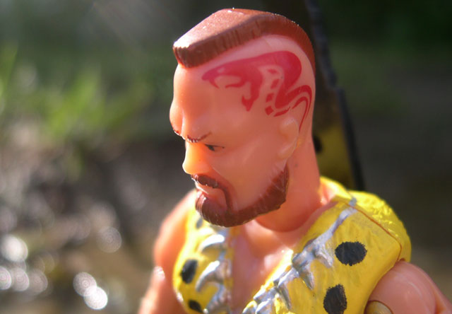
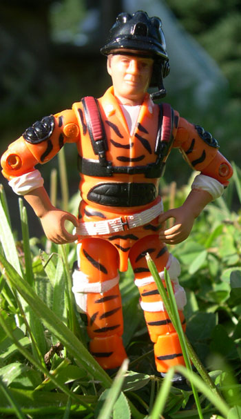
 Affectionately
(or not-so affectionately) referred to as "pumpkin head", this version
of Beachhead is bright and cheery...exactly what Beachhead should not be.
Affectionately
(or not-so affectionately) referred to as "pumpkin head", this version
of Beachhead is bright and cheery...exactly what Beachhead should not be.
His placement in a team of this nature seems to make a lot of sense. A mean-spirited Army Ranger who likes leading jungle patrols and making recruits regret joining up, he seems to be the natural choice for leading a small jungle operation in the Florida Everglades to combat the Dreadnoks.
However, what does not work really well, especially in a jungle setting, is his bright orange uniform proudly emblazoned as a "tiger".
Like the European exclusives, though, that's not to say that the figure is bad necessarily. Joe figures can work on several different levels, and don't just have to be military soldiers to work. I don't mind having figures that look nice on my shelf and don't work within a strict military environment, as long as they look okay.
Strangely enough, I find myself intrigued by this Beachhead figure. While I admit that he has absolutely no place as the leader of a jungle mission in any sort of the "real world", I absolutely love the color scheme from a design and display stand point.
It's not even necessarily the orange, although that is a great and vibrant color, but the complimentary colors that surround it. The olive green used on his vest is a terrifically muted hue of green which works off of the orange and the brown to near-perfection. It's military-like, yet a different green than we're used to, and working off the orange, I really, really like it.
It's strange, but it works like the European exclusive bright blue works...it's a different, odd color that might not be so cool on its own, but in concert with another pallet of colors, it just looks nice.
Working along with this great green color are Beachhead's brown pants, which also look pretty nice. It's a dull, dim shade of brown that is in strong contrast to the orange uniform, but looks great and adds some "jungle ops" realism to an otherwise ridiculously bright and unrealistic color scheme.
There are some other nice touches evident in the paint and mold combination as well, with the straps over his shoulders a nice color as well as the magazines in the pouches on his vest. His belt, gloves, and other minor touches all done in a flat black which all works together with the stripes on his uniform. What you end up with a nice figure that looks pretty cool on display, but it pretty near useless on the battlefield.
The mold hasn't really done much for me in the past, and in all honesty, still doesn't...it just doesn't capture the essence of Beachhead's personality...it doesn't look mean enough. Still, it's a decent mold and on display anyway, the figure works...just don't expect much dio-story usage out of him.
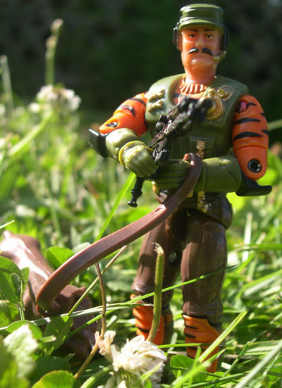 Like
Buzzer and Ripper up above, you can probably expect much of the same review
for Mutt and Beachhead.
Like
Buzzer and Ripper up above, you can probably expect much of the same review
for Mutt and Beachhead.
A lot of people are big fans of the original Mutt mold...I can't really say why, but I'm not one of them. His facial sculpt is nice and angry, and he looks mean, like he should...but the rest of the figure just doesn't mesh with me. The colors are nice, and the figure is well-detailed, especially for an early mold. Even though he was released before '85, he seemed on the bulkier side and was overall not a bad figure. Yet, still, I didn't find much use for him.
This Mutt, though, is a completely different story. I really, really like this figure a lot. As anyone who has read any of my reviews (or Dio-Stories for that matter) can attest to, I am a big D.E.F. fan. I really enjoy all of the molds used in that cool little subgroup, including this one.
This figure takes all of the qualities of Mutt and cranks them up a notch, then adds some cool new qualities that make this figure stand apart from the crowd. His face is obviously Mutt, something that Hasbro has not quite perfected these days (making new characters resemble their classic counterparts) but the addition of the hat and comm device is great. His body armor is definitely designed for urban warfare (which begs the question, why is he on a jungle op?) and the overall sculpt is nice and bulky, but still "clean". His arms are slim, but bulked up nicely by padded gloves, his left one even marked my teeth marks. They blend nicely with the elbow pads, and speaking of padding, his shine pads are very well-detailed, too.
But all of these facts hold true of the classic version as well...which is not the one I'm reviewing. Guess I should concentrate on what makes this one different.
There are many similarities between this figure and the Beachhead figure, which is actually nice, because they both flow with each other seamlessly. However, with only a few minor alterations, this figure ends up a lot better than Beachhead, I think. Without the orange on the head, it actually tones down the overall color scheme considerably. He's got orange on the arms like the squad leader, and his vest is that same great green shade that Beachhead has. The brown on his pants matches Beachhead's, too but the orange on the shin pads adds a great splash of color, too. All of the small details throughout the figure are nicely detailed, too, with hints of gold, and even with the garish colors the overall look of the figure is pleasant enough for display. Again, definitely not jungle ops dio-story material, but very nice for display purposes, and I like how he blends with Beachhead.
His accessories are pretty well chosen as well, with a brown Junkyard and leash, and the same black pistol he had with his DEF incarnation, and Wide Scope's sniper rifle, all of which are well-chosen and appreciated. All in all, while Mutt isn't a character I really enjoy, this figure is a decent enough one to display, but not to use.
 Since
last year, the new tradition of the "mystery figure" has been launched
and in both cases I think the choices ended up being somewhat of a mixed bag.
Since
last year, the new tradition of the "mystery figure" has been launched
and in both cases I think the choices ended up being somewhat of a mixed bag.
Last year, the choice of Major Storm was appreciated by some and maligned by others...while I liked the obscure character choice, the Major Storm figure isn't really that exciting and didn't prove to really add a whole lot to the set. In the case of Hardtop, I like the character choice and the figure mold isn't too bad, but it is hampered by some strange color choices. While the other two Tiger Force figures both have bright colors of their own, Hardtop goes beyond the call of duty and ends up sticking out like a sore thumb.
The nicest parts about the color schemes of the other figures was how the orange was complimented by the dull green and brown colors...not so with this figure. Hardtop is bright, plain and simple!
I consider myself pretty lucky when it comes to finding figures complete with their microphones. I got Heavy Metal for $12.00 and Hardtop for $8.00, both complete only a few years ago...of course, Karma is funny that way, and I'm still without a Lift Ticket and Cold Front, and refuse to pay the large sums of money being asked for them.
A lot of people, though, have a hard time finding a complete Hardtop, so for them, this could be a good way to get one, except for the fact that this figure is even obnoxiously brighter than the original baby blue version.
The Hardtop mold, while obscure, doesn't really do a whole lot for me. It's pretty plain and non-descript with nothing that makes it stand out. Add that to the fact that on this figure they're using Firefly's legs and the overall effect of this particular figure is kind of underwhelming. His straps and padding break up the monotony a little bit, but not enough to be 100% effective, and not enough to make this mold really stand out.
Now add all of this to the fact that this figure doesn't just have orange highlights...or parts of the orange uniform showing...this guy is plan old orange from top to bottom. Riddled with orange and tiger stripes, he doesn't even end up really matching the other two characters in the set, which is the main draw to these figures. Instead of green and brown uniform touches, he's got bright white belts and straps, which only make the rest of the uniform seem brighter. He just does not come together like the other two figures, not even for display purposes.
As an alternative to a complete Hardtop, this may not be a bad bet...but the figure itself on it's own merits just doesn't really do anything for me, and is definitely the weakest Joe of the set...which is a shame, because I approve of the obscure mold and character chosen...just wish there was some more color variation involved.
This covers the figure set for the 2004 Collector's Convention...head on over to Page Two to check out the attendee bonuses and a whole lot more pictures!
Back To Collectors' Club Reviews