G.I. Joe Night Force (TRU Exclusive)
The theory of the Joe subteam has been debated for a long time…probably since 1988 or so, when Tiger Force first made their illustrious appearance. Were these factions just shady reasons for re-using figure molds? Were they actually well thought out and executed, or just slapped together for a quick buck?
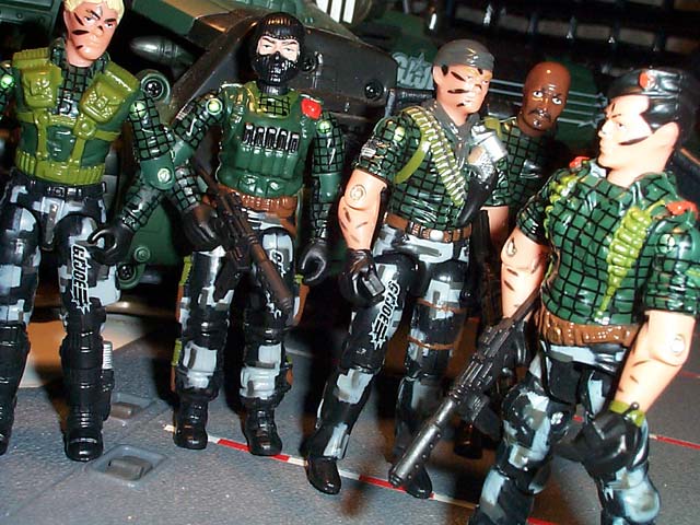
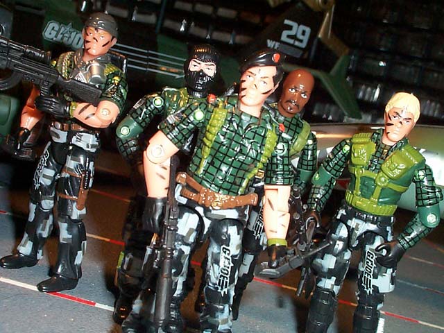
It’s a mixed bag, as some of each case is true, I think, and that continues to be the case today. This new Night Force set is one $20.00 six pack of mixed bags.
Upon first glance at the G.I. Joe Convention last summer, I was ecstatic. These figures looked fan-friggin tastic. Dark green/black uniforms with the same pattern, yet much more toned down, not quite as glossy. They all mixed together great and looked like a nice team. Now that I have them in hand, though, my opinions are a little bit more on the fence.
First of all, as a team, they still look pretty nice. The consistent, uniform colors all blend together nicely and the designs are nice to look at. It’s the details where the set really starts to suffer a little bit.
The cross pattern just looks a little weird to me. Hasbro is obviously trying something new and different, but I honestly don’t know if it works, especially since in some cases the pattern just doesn’t look right. It ends up bleeding onto some parts that it’s not supposed to, and is blank on parts where it does belong. All in all, the funky pattern leaves me a little cold.
However, where that pattern falters, the camo arrangement on the legs works wonders. I think Hasbro pulled off the digital urban/night camouflage to near perfection and I’m quite pleased with how the paint apps look in nearly all cases. In some early protos the paint apps looked a little sloppy, but thankfully that doesn’t seem to be the case here, and the pattern is crisp and nicely applied. It adds a great amount of flash and flair to what could have been a boring figure, and yet maintains a consistent “Night Force” look to it.
I'm very happy with the decal application as well. The Night Force logo on their left arm is very nicely done, and the flag on the right works perfectly. At first, I didn't realize it was supposed to be reversed, and was upset that such an "obvious detail" was missed, but thanks to Beav and this link, I now know this is how it's supposed to be presented. So kudos to Hasbro for knowing this and presenting it accurately on these figures.
Accessories are another sore spot for obvious reasons. In some cases (Roadblock’s M60, the AK-47) the guns are pretty nice. But to include THREE Crimson Twin pistols…I just don’t get it. What a waste of friggen plastic that gun is. Then to not include a mortar of some kind for Short Fuze, the “Mortar Trooper”, well, that’s another decision that just makes me confused. They even have a recent mortar mold from the Wave 5 Recondo/Iron Grenadier. Roadblock having his signature M2 w/ blackpack would have been much appreciated, too.
But I should probably break this set down by individual figures as well...
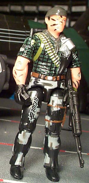
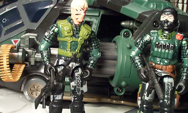
First of all, let’s cover Tunnel Rat. He’s probably the standard in the Night Force set…he’s the figure that’s pretty decent, nothing great, but not too bad and every other figure in the set is kind of compared to him, at least in my mind.
The colors work really well for TR, except that those bell-bottom style pants look pretty funky in the digital camo. There’s nothing really wrong with it, they just don’t really look 100% right. The deep green compliments him well and the intricate paint apps on the torso really bring the mold to life. Using the green base and coloring the machine gun belt silver and black really makes it look real. Combine that with the black holster and silver gun and grenades, and that is another bright spot in the torso mold. Not only all of those details, but the straps are detailed in a nice leathery brown, too, which only improves things further.
On Tunnel Rat the facial and arm camouflage looks right in place, as he was created with it originally, and the Night Force deco compliments the mold very nicely. He’s not a figure that really screams out to me, but he’s a decent Night Force figure and an awesome compliment to the overall look of the set.
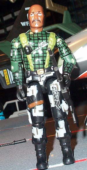
Next in line is Roadblock. Ummm…yeah.
This mold needs to die a quick and violent death. Roadblock has been an iconic character since his arrival in 1984, but this mold just does not represent him well at all. The new body changes in ’85 made RB look quickly dated (so much so that they released a new version of him 2 years later, in ’86…one of the quickest re-molds back in the day) and trust me, here, about 20 years later, this mold looks even more dated.
Not to mention the fact that Hasbro took his tank top and tried to make a full sleeve green shirt out of it (which just doesn’t look right). His straps are merely a different shade of green, and he’s got some interesting paint apps here and there, but the figure, mold and paint scheme, is largely forgettable. It’s a shame they released him in this set, when I’m sure there were several other better choices to make. We know they have a good portion of Falcon’s mold (minus the legs…) so why not get him in this cool NF gear? I’d much rather see that than this mold that looks older than it is.
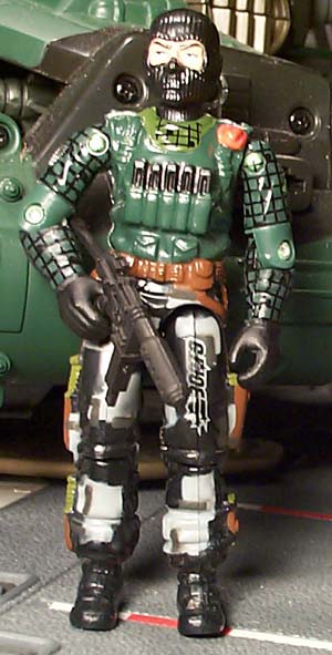
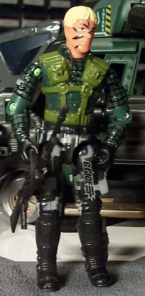
Beachhead
is next on the chopping block. I’ll be honest here- I’m not really
a Beachhead fan. At all.
This mold was interesting back in the day, but it looked almost oversized and
“fat”. His head is huge and his body is stocky and to me just doesn’t
look right. As a kid, Beachhead got zero use out of me, and his overbearing
jerk personality in the cartoon did not help his case in the least.
Well, over the years I’ve gained a new appreciation for the Army Ranger, and have learned to love a lot of the nuances of his original mold. The folded red beret in his flak vest. Those great baggy tiger stripe camo pants…he’s got a lot of redeeming qualities. Plus I hear he’s a good surfer, too… ;)
In all seriousness, this version of Beachhead takes most of what was cool in the original and…well…makes it a little worse. What was a great deep green suit with black flack vest is now a funky monochrome green with that odd cross-hatch pattern over some of it. Hasbro does an okay job of defining the edges of the flak vest by not putting the pattern there, but it’s the same color as his shirt and ends up looking kind of drab. Not only that, but the cross pattern at his sternum above the vest doesn’t really match the pattern of the shirt underneath and just ends up looking a little strange. The baggy pants still look cool, and this new digital camouflage pattern is pretty neat as well, although it doesn’t make nearly as much sense as the tiger stripe camouflage of 1986.
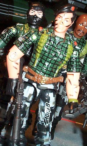
Next up is Flint. Ever since I first read his filecard in 1985, I have been a HUGE Flint fan. He is probably one of my favorite characters in all of Joedom, but his overuse in the toon (and in fanfic for that matter) has relegated him to a background character for me. I really want to explore his character and make him someone interesting, which is one of the things I still want to do before my Dio-stories fade away.
Up to this point, as cool a character as Flint is, he’s really been shafted with versions of his characters released. His first iconic mold is really the only one worth speaking about (although I do love the Battle Corps version, it doesn’t really scream “Flint” to me…) and I’m glad to see Hasbro has this mold back from India’s grasp. What they do with the mold is pretty great as well.
His shirt goes from the standard black leather-type look to this funky green shade this new Night Force has brought upon us, and is embued with this weird cross-hatch pattern. Thankfully the color looks pretty cool on Flint and is only made better by the nice touches of color at his shoulders and in the straps going down his chest. Like Tunnel Rat, Flint’s shotgun shells are trimmed in metallic, so they don’t just become monochrome background shapes on his torso…they actually look like the shells they’re supposed to represent.
His pants also look nice in this new camouflage pattern, and I dig the silver pistol in the holster on his right thigh—it adds a nice little splash of color. Even his boots are done in a couple of different shades, and color is really the name of the game with most of these exclusives. Ever since Tiger Force last year, it’s been about paint decos really drawing attention to these sets, and this one is no different.
Now Short Fuze is where this set really starts to shine. I am a huge fan of the Downtown mold, and always have been. Those of you who recall my profiling days will remember that one of my first profiles covered the Downtown figure, and he continues to grow on me to this day. The fact that they took Downtown, who already should have been a replacement Short Fuze, and made him into SF is a very cool touch to me. Of course they completely negate the purpose of a mortar soldier in this set by not even giving him a mortar! Huh?
On to the figure itself—I can’t think of too much to complain about in all honesty. The original figure mold has always been on my favorites list. His facial sculpt was unique, and the mold was great from the cool pouch detailing, nicely aligned with the chest straps, all the way down to the cool and different shin guards/boot combination. However, the ’89 version has some glaring issues, most notably the colors. While I do like bright colors, I understand the value of a subdued color scheme to a military operative and a mortar soldier in baby blue and red would probably stand out a little on the battlefield. Thankfully, they took all the great parts of this figures mold and transformed him flawlessly into a great Night Force figure. All of the terrific details that made him a good figure originally appear only better in this dark green and gray camo paint scheme.
However, there is one main thing that really hurts this figure, and as a result, hurts the overall performance of the set as well. Short Fuze doesn’t come with any decent weapons. This makes zero sense to me. I would have been ecstatic if we had gotten Downtown’s original accessories—especially that helmet, pistol and backpack. But we got none of them…we didn’t even get a mortar! We know they have the mold for one, and yet, they didn’t think to include it in the set. It’s odd decisions like this that make it tough for us Hasbro stalwarts to keep defending them. :) Granted, it’s not a HUGE deal, but it just seems like a dumb lack of judgement.
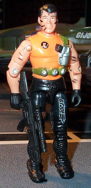
Now…quite
definitely the most controversial member of this new Night Force team, and I
saved him for last—Action Man.
Personally, I am confounded as to why so many people seem to have an issue with
Action Man being included in this set. Yeah, his code name is goofy, but it’s
a great nod to long-time collectors, and to our European friends, who have had
some lousy luck getting their share of Joe stuff oversees. It’s very cool
that Hasbro is willing to take a little leap and try and tie some continuities
together from across the pond, and the fact that he’s included here means
that we might possibly get some Action Force figures in the future, which would
absolutely thrill me.
But I’m
not sure if people are really upset about the figure himself, or his paint scheme…
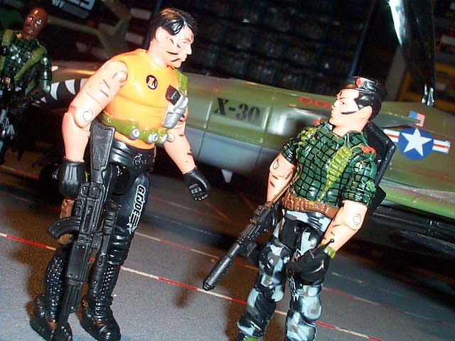
As I’ve said, I don’t have a major problem with bright colors…however
in a set labeled “Night Force” having a guy in a bright orange shirt
seems pretty dumb. But, I still really love this figure and am glad to see him
included. He does seem like an afterthought, quite frankly, his overall color
scheme not even close to that of his Night Force comrades. I have to wonder
if Action Man ended up like the Python Patrol SAW Viper—they ran out of
budget for paint apps, so they had to simplify the paint scheme and come up
with something interesting. If that is the case, I think they did a great job
with the resources they had.
Back when
G.I. Joe wasn’t being released over here, my Mom made a few trips to
Europe and promised to hook me up with any items she could find. Well, I ended
up with quite the collection of 12” Action Man toys, and while not really
what I had in mind, I immediately had an affinity for Action Man, and the European
members of the Joe team in general. Finances have limited me to collecting all
that I want to from the foreign countries, but seeing some of them represented
in the states is nothing but cool to me.
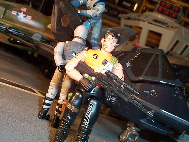
As for the figure itself—apart from the Night Force designation I can’t find too much wrong with it, actually. In my universe, Tracker is dead and buried, so I don’t mind that this mold found use as someone else, and it seems to fit Action Man’s personality pretty well. The orange shirt is glaring, but orange and black are Action Man’s primary colors, so I think this uniform’s color scheme fits him well. The mold is very nice, too. It’s of that early 90’s vintage where the military elements were slowly slipping away, yet the figure molds were still very cool. The plain, almost rubberized shirt with the simple single strap of grenades comes across very well on this figure. His legs and boots look a little funky as they did with Tracker, but Action Man’s almost super hero-ish designation doesn’t make it seem like such a stretch. All in all, the mold and colors come together very well to create an excellent new figure and character for the Joe mythos. I honestly cannot bring myself to include him with my Night Force team, as he’s too bright and doesn’t match their uniform patterns, but I will try and integrate him into my Joeverse in some way and get some use out of a good mold.
So, overall, the set, like I said, is very mixed. The character selections are terrific, and the overall paint scheme is very inspired, but a number of minor odd decisions just add up in this particular six-pack and leave me with a less-than-satisfied taste in my mouth. Perhaps it’s that this TRU exclusive is being compared to the recent APC and COBRA Infantry Forces, to which it pales in comparison, but overall, it’s an okay set, but nothing to write home about.
Should you buy it? Unfortunately, I can’t put my full faith behind it. The questionable accessories and some odd paint apps make it a wishy washy choice. To me it was worth the $20 for Action Man and Short Fuze, and a quartet of other decent figures, but for others who don’t like those molds or colors, it’s much more of a toss up. See if some pictures will help make up your mind.